OnlyFans Header & Cover Guide (2026): Correct Size, Design Tips & Free Templates
Your OnlyFans header (cover image) does more than “look nice”. It decides whether a new visitor immediately understands your vibe, your niche, and why they s...

Your OnlyFans header (cover image) does more than “look nice”. It decides whether a new visitor immediately understands your vibe, your niche, and why they should subscribe. The problem is that most banners look great in a design tool, then get cropped badly on mobile, clash with the profile photo, or bury the one thing a subscriber needed to see.
This guide focuses on 2026 best practices: safe sizing, mobile-first layout, design rules that convert, and “free templates” you can copy in Canva/Photopea/Photoshop in minutes.
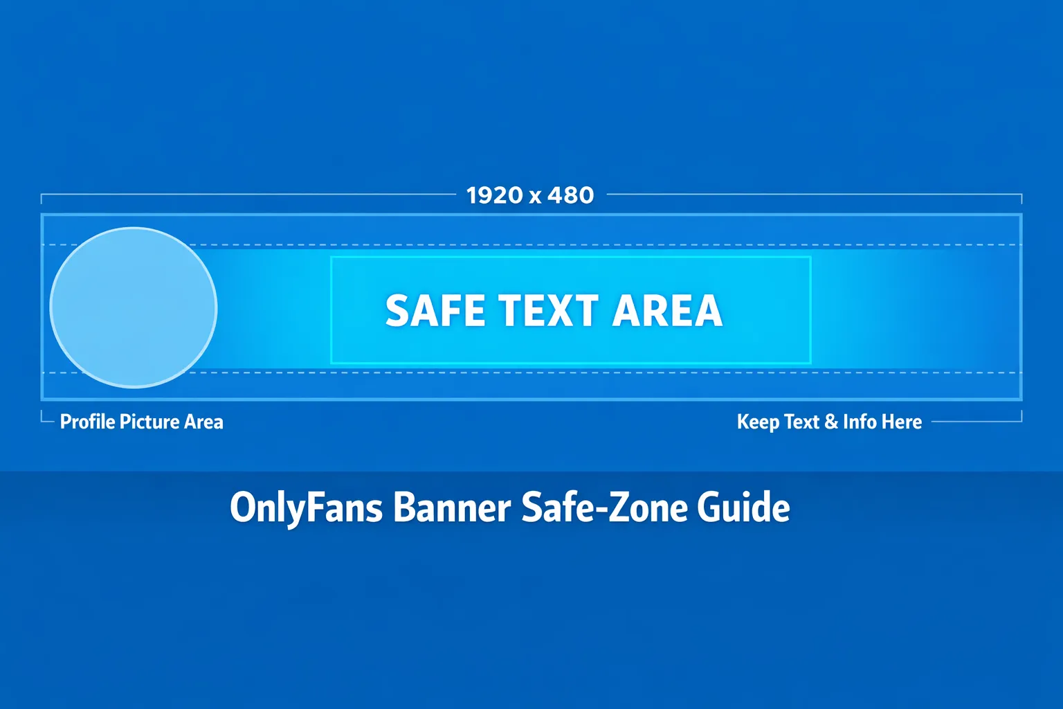
OnlyFans header size (2026): what to use so it looks right everywhere
OnlyFans has changed UI details over time, and cropping can vary slightly by device and browser. There is not always a single official spec that creators can rely on.
That said, the most commonly used creator-safe standard is:
- Banner/header (cover): 1920 × 480 px (4:1 aspect ratio)
If you design at that size and keep your important elements inside a safe zone (below), you will avoid most mobile cropping issues.
Recommended “safe zone” (so text does not get cut off)
Even when your banner is 1920 × 480, the UI can hide parts of the left side (profile picture overlap) and trim top or bottom on some screens.
A practical safe zone that works well for most creators:
-
Keep all text and logos in the middle 60 to 70% of the banner width
-
Avoid placing critical text in the far-left area (it often collides with your avatar)
-
Leave padding at the top and bottom so you are not relying on edge pixels
Quick sizing table (use this when building templates)
Because cropping is the real issue, size alone is not enough. Use the table below to design with fewer surprises.
| Asset | Practical size to design | Aspect ratio | Common cropping risk | Safe placement rule |
|---|---|---|---|---|
| OnlyFans header / cover | 1920 × 480 px | 4:1 | Left side overlaps with profile photo, some vertical trimming on mobile | Put text in centered safe zone, leave padding |
| Profile picture (avatar) | 800 × 800 px (export square) | 1:1 | Gets displayed as a circle, edges are cut | Keep face/logo centered, avoid edge text |
Note: The avatar is often uploaded as a square but displayed as a circle, so design it like a “circle-safe” logo.
What your header should communicate in 2 seconds
When someone lands on your profile, they are asking three silent questions:
-
Who are you? (persona)
-
What do I get here? (content promise)
-
Is this for me? (niche fit)
Your header should answer those without reading your entire bio.
A simple decision framework: minimal vs. informative banners
Use this to decide what kind of banner to build.
Choose a minimal banner if:
-
Your face and vibe are the brand (strong visual identity)
-
You drive traffic from platforms where people already “know the story” (existing audience)
-
You want a premium, high-end look with fewer words
Choose an informative banner if:
-
Most visitors are cold traffic (Reddit/Twitter/X, shoutouts, promo pages)
-
Your niche needs clarity (cosplay character, fetish niche, GFE vibe, no-face brand)
-
You sell a lot via DMs/PPV and want to signal what’s inside
A good compromise is: minimal design + one clear promise line.
Design tips that actually increase conversion (not just aesthetics)
1) Design mobile-first, then make it pretty
Most creators design on a laptop and forget that most visitors browse on phones. Build the banner at 1920 × 480, but preview it at phone width.
Practical rule: If you cannot read the main line at “small preview” size, it is too small.
2) One focal point, one message
If your header has:
-
a busy background,
-
3 fonts,
-
4 messages,
-
and tiny icons,
the user will understand none of it.
Aim for:
-
One focal image (you or a signature visual)
-
One primary headline (your promise)
-
Optional small subline (posting vibe or content style)
3) Put the “promise” on the right side, not the left
The left side is where overlap happens (avatar + UI). If you include text, put it center-right.
Examples of clean promise lines (keep it simple and honest):
-
“Cosplay sets, behind the scenes, and weekly drops”
-
“GFE vibes, daily chats, and custom requests”
-
“No-face creator, POV content, consistent uploads”
Avoid guarantees like “I post 10 times a day” unless you truly do.
4) Use contrast like a marketer
Your banner is often viewed in bright environments. If your text sits on a photo, add a subtle overlay:
-
Dark overlay on the background (10 to 30% opacity)
-
Light text (off-white, not pure white)
This keeps it readable without looking cheap.
5) Match your avatar and banner so you look “real”
Profiles that convert tend to look cohesive:
-
Same color palette
-
Same filter style
-
Same vibe (luxury, girl-next-door, alt, cosplay, fitness)
Your header is not the place to experiment with random aesthetics.
Free templates you can copy (Canva, Photopea, Photoshop)
These are “free” in the sense that you can recreate them with any free design tool. Each template is built around a conversion goal.
Template A: The clean creator brand (minimal + premium)
Best for: creators with strong visuals, simple niche, premium positioning.
-
Canvas: 1920 × 480
-
Background: one strong photo (close-up or mid-shot)
-
Overlay: dark gradient from left to right
-
Text (right side):
-
Line 1 (bigger): your stage name
-
Line 2 (smaller): one promise line
-
Font pairing ideas you can find in Canva:
- A clean sans serif for name + lighter sans serif for subline
Template B: The “what you get” banner (cold traffic friendly)
Best for: Reddit/Twitter/X traffic, niche clarity, faceless brands.
-
Canvas: 1920 × 480
-
Background: textured gradient or blurred photo
-
Three “content pillars” as short phrases (not icons)
-
Keep the pillars center-right in one line or stacked
Example pillar structure:
-
“Teasers in feed”
-
“Full sets in PPV”
-
“Customs on request”
Keep it factual and aligned with what you actually sell.
Template C: The no-face safety banner (privacy-first)
Best for: no-face creators who want brand clarity without revealing identity.
-
Canvas: 1920 × 480
-
Background: silhouette, masked look, hands, body crop, or abstract aesthetic
-
Text: niche + vibe
-
Optional: “No-face” or “Anonymous creator” only if you want that to be part of the brand
Privacy note: If anonymity is the goal, avoid using the same photo set across multiple platforms without edits (reverse image search is real).
How to build these templates in Canva (fast)
-
Create a custom design: 1920 × 480
-
Drop in your background image
-
Add a rectangle overlay with transparency
-
Add text in the center-right safe zone
-
Export as PNG or high-quality JPG
If the uploader rejects a format or compresses heavily, try the other format. Platforms and uploaders can change.
Upload checklist (so you do not waste 45 minutes)
Use this quick checklist every time you update your header.
-
I tested it on mobile (not just desktop)
-
My main text is not on the far left (avatar overlap)
-
Nothing important is within edge padding (top/bottom trimming)
-
The banner matches my avatar (same vibe and color)
-
One message only (no clutter)
-
Text is readable at a glance (high contrast)
-
No sensitive info is visible (location, watermark mistakes, reflections)
Common mistakes (and what to do instead)
Mistake: Using a banner that looks like an ad
If it screams “BUY NOW”, it can reduce trust.
Better: brand it like a profile, not a billboard. One calm promise line is enough.
Mistake: Tiny text and too many details
Remember: your banner is not your bio.
Better: one headline, one subline. Put the rest in your bio, pinned post, and DMs.
Mistake: Reusing your Instagram/Twitter header as-is
Different platforms crop differently.
Better: rebuild in 4:1 and place text center-right with padding.
When it might be worth getting help (and when it is not)
You probably do not need help if:
-
You are early-stage and still testing your niche
-
Your traffic is low, so you are not yet optimizing conversion
-
You enjoy design and can iterate quickly
You might benefit from help if:
-
You are getting clicks but conversion is weak (branding mismatch)
-
Your page looks inconsistent across platforms
-
You want a full growth system (marketing, chat, posting strategy, privacy)
Lookstars works with creators on multi-platform marketing, posting strategy, 24/7 fan chatting, and privacy-focused protections (like leak monitoring and takedowns) so you can stay focused on content without juggling everything yourself. If you want to explore that kind of support, you can apply via Lookstars Agency.
Ready to transform your career?
Join hundreds of creators already earning six figures with Lookstars Agency.
Share this article
Best OnlyFans Agency
Europe's Leading OnlyFans Management Agency.
100% Free Ebook
Get our guide and unlock the secrets to OnlyFans success.
100% Free Ebook
Get our guide and unlock the secrets to OnlyFans success.
Free Revenue Calculator & Profile Analyzer
Try them for freeContinue reading...
Am I Attractive Enough for an OnlyFans Agency? The Answer

Can You Ever Fully Delete Your OnlyFans Content? The Reality
